
Building a decision tree chart with graphviz
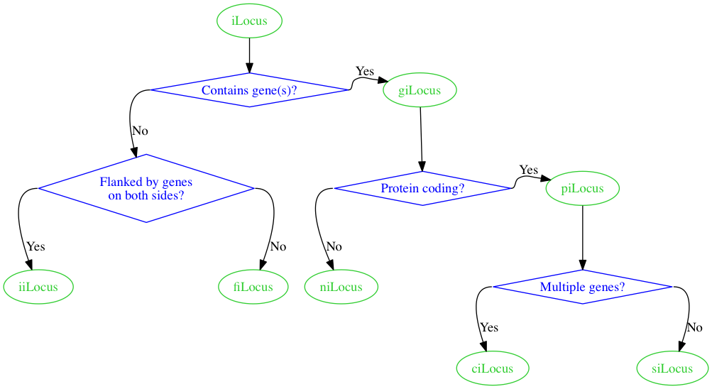
I'm preparing a manuscript, and I sketched out the following chart I would like to include.
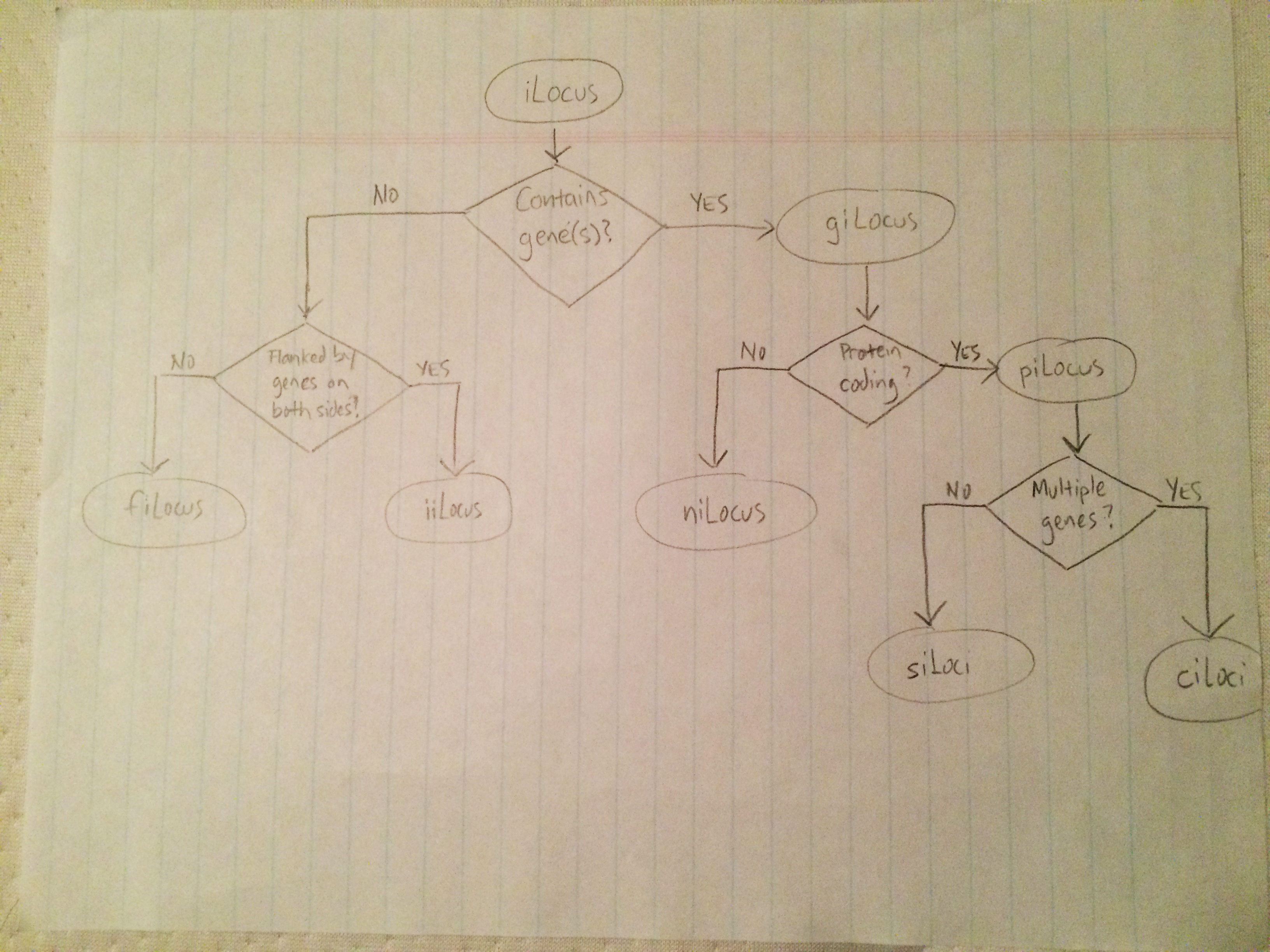
With my rudimentary graphviz experience, I threw together the following representation.
digraph
{
    ilocus [label="iLocus"]
    gilocus [label="giLocus"]
    pilocus [label="piLocus"]
    nilocus [label="niLocus"]
    silocus [label="siLocus"]
    cilocus [label="ciLocus"]
    filocus [label="fiLocus"]
    iilocus [label="iiLocus"]

    containgene [label="Contains gene(s)?"]
    proteincoding [label="Protein coding?"]
    multiplegenes [label="Multiple genes?"]
    geneflank [label="Flanked by genes on both sides?"]

    ilocus -> containgene
    containgene -> geneflank [label="No"]
    geneflank -> filocus [label="No"]
    geneflank -> iilocus [label="Yes"]
    containgene -> gilocus [label="Yes"]
    gilocus -> proteincoding
    proteincoding -> nilocus [label="No"]
    proteincoding -> pilocus [label="Yes"]
    pilocus -> multiplegenes
    multiplegenes -> silocus [label="No"]
    multiplegenes -> cilocus [label="Yes"]
}
Saved as take1.dot and rendered with the command dot -Tpng -o take1.png take.dot, we get this.
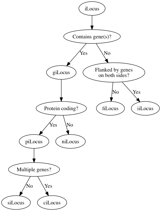
It's not bad for a first pass, but let's adjust the style a bit to distinguish between iLocus designations and branching logic.
digraph
{
    node [color=Limegreen,fontcolor=Limegreen,shape=oval]
    ilocus [label="iLocus"]
    gilocus [label="giLocus"]
    pilocus [label="piLocus"]
    nilocus [label="niLocus"]
    silocus [label="siLocus"]
    cilocus [label="ciLocus"]
    filocus [label="fiLocus"]
    iilocus [label="iiLocus"]

    node [color=Blue,fontcolor=Blue,shape=diamond]
    containgene [label="Contains gene(s)?"]
    proteincoding [label="Protein coding?"]
    multiplegenes [label="Multiple genes?"]
    geneflank [label="Flanked by genes\non both sides?"]

    ilocus -> containgene
    containgene -> geneflank [label="No"]
    geneflank -> filocus [label="No"]
    geneflank -> iilocus [label="Yes"]
    containgene -> gilocus [label="Yes"]
    gilocus -> proteincoding
    proteincoding -> nilocus [label="No"]
    proteincoding -> pilocus [label="Yes"]
    pilocus -> multiplegenes
    multiplegenes -> silocus [label="No"]
    multiplegenes -> cilocus [label="Yes"]
}
That gives us the following.
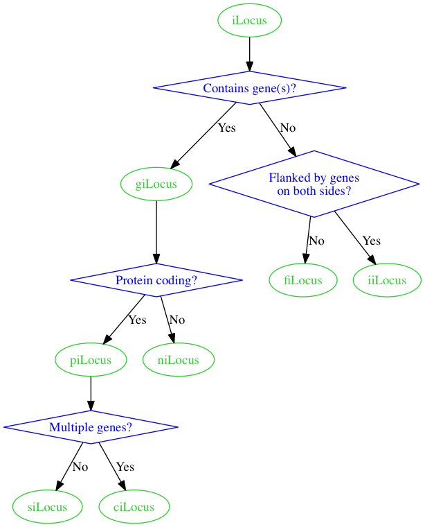
Now, let's see if we can get the giLocus and piLocus nodes on the same level as in the sketch, using rank=same.
digraph
{
    node [color=Limegreen,fontcolor=Limegreen,shape=oval]
    ilocus [label="iLocus"]
    gilocus [label="giLocus"]
    pilocus [label="piLocus"]
    nilocus [label="niLocus"]
    silocus [label="siLocus"]
    cilocus [label="ciLocus"]
    filocus [label="fiLocus"]
    iilocus [label="iiLocus"]

    node [color=Blue,fontcolor=Blue,shape=diamond]
    containgene [label="Contains gene(s)?"]
    proteincoding [label="Protein coding?"]
    multiplegenes [label="Multiple genes?"]
    geneflank [label="Flanked by genes\non both sides?"]

    {rank = same; containgene; gilocus}
    {rank = same; proteincoding; pilocus}

    ilocus -> containgene
    containgene -> geneflank [label="No"]
    geneflank -> filocus [label="No"]
    geneflank -> iilocus [label="Yes"]
    containgene -> gilocus [label="Yes"]
    gilocus -> proteincoding
    proteincoding -> nilocus [label="No"]
    proteincoding -> pilocus [label="Yes"]
    pilocus -> multiplegenes
    multiplegenes -> silocus [label="No"]
    multiplegenes -> cilocus [label="Yes"]
}
That gives us the following.
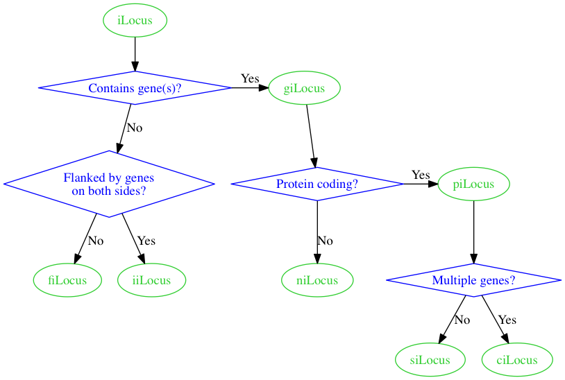
Getting there!
Now, let's use the compass_pt feature to specify which side of the diamonds we want the arrows to come from.
digraph
{
    node [color=Limegreen,fontcolor=Limegreen,shape=oval]
    ilocus [label="iLocus"]
    gilocus [label="giLocus"]
    pilocus [label="piLocus"]
    nilocus [label="niLocus"]
    silocus [label="siLocus"]
    cilocus [label="ciLocus"]
    filocus [label="fiLocus"]
    iilocus [label="iiLocus"]

    node [color=Blue,fontcolor=Blue,shape=diamond]
    containgene [label="Contains gene(s)?"]
    proteincoding [label="Protein coding?"]
    multiplegenes [label="Multiple genes?"]
    geneflank [label="Flanked by genes\non both sides?"]

    {rank = same; containgene; gilocus}
    {rank = same; proteincoding; pilocus}

    ilocus -> containgene
    containgene:w -> geneflank [label="No"]
    geneflank:e -> filocus [label="No"]
    geneflank:w -> iilocus [label="Yes"]
    containgene:e -> gilocus [label="Yes"]
    gilocus -> proteincoding
    proteincoding:w -> nilocus [label="No"]
    proteincoding:e -> pilocus [label="Yes"]
    pilocus -> multiplegenes
    multiplegenes:e -> silocus [label="No"]
    multiplegenes:w -> cilocus [label="Yes"]
}
We end up with this.
Everything looks good here except for the edges.
Is there any way we can force straight edges with corners, like in the sketch, rather than the curved edges?
The splines=ortho setting seems to be designed just for that.
Let's try it out (also requires setting edge labels to xlabel).
digraph
{
    graph [splines=ortho]

    node [color=Limegreen,fontcolor=Limegreen,shape=oval]
    ilocus [label="iLocus"]
    gilocus [label="giLocus"]
    pilocus [label="piLocus"]
    nilocus [label="niLocus"]
    silocus [label="siLocus"]
    cilocus [label="ciLocus"]
    filocus [label="fiLocus"]
    iilocus [label="iiLocus"]

    node [color=Blue,fontcolor=Blue,shape=diamond]
    containgene [label="Contains gene(s)?"]
    proteincoding [label="Protein coding?"]
    multiplegenes [label="Multiple genes?"]
    geneflank [label="Flanked by genes\non both sides?"]

    {rank = same; containgene; gilocus}
    {rank = same; proteincoding; pilocus}

    ilocus -> containgene
    containgene:w -> geneflank [xlabel="No"]
    geneflank:e -> filocus [xlabel="No"]
    geneflank:w -> iilocus [xlabel="Yes"]
    containgene:e -> gilocus [xlabel="Yes"]
    gilocus -> proteincoding
    proteincoding:w -> nilocus [xlabel="No"]
    proteincoding:e -> pilocus [xlabel="Yes"]
    pilocus -> multiplegenes
    multiplegenes:e -> silocus [xlabel="No"]
    multiplegenes:w -> cilocus [xlabel="Yes"]
}
Which gives us this.
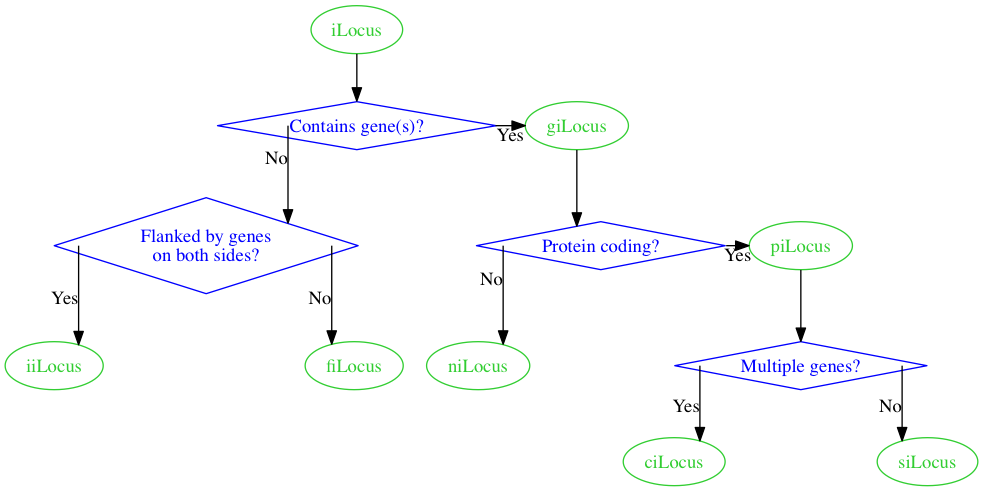
Whoa, definitely not what I had in mind.
I haven't been able to figure this last step out.
If I can't figure out how to force straight edges with corners, then I think I'll have to go with "take 3" above, the last figure before the compass_pt feature was used.